Branding

Pave Power

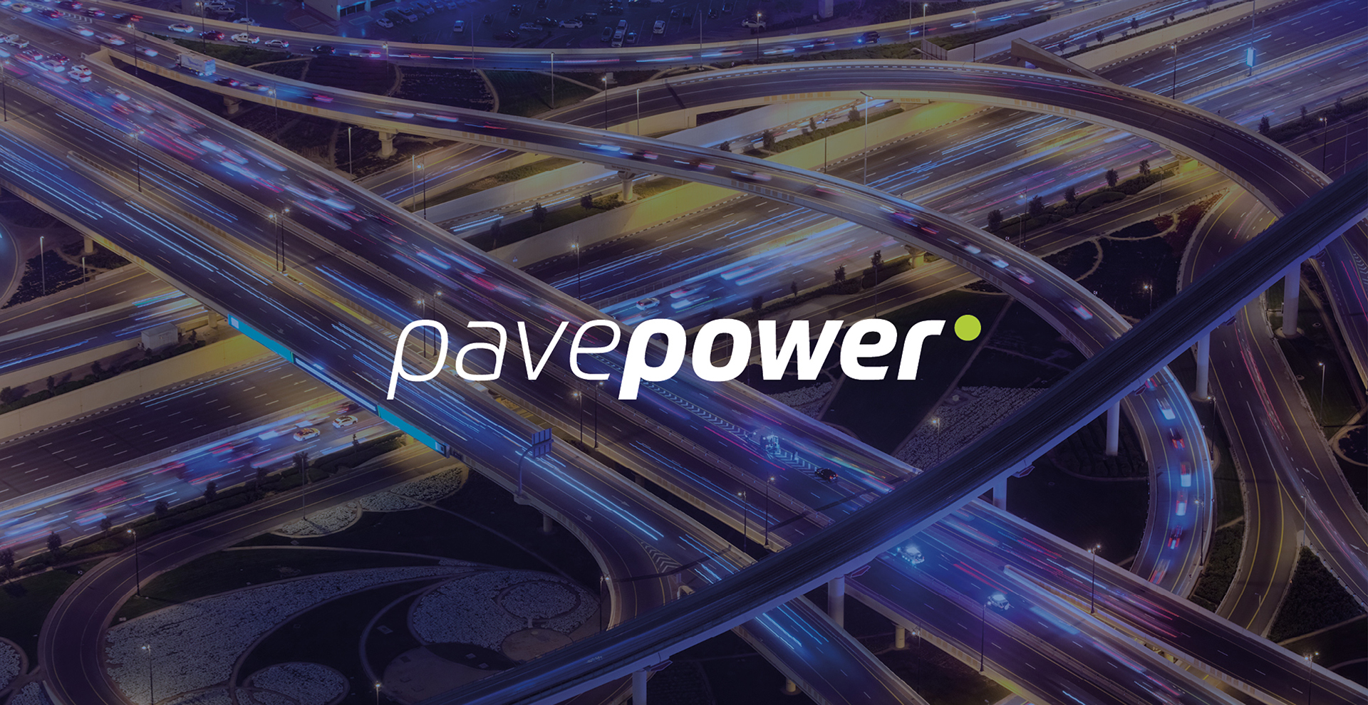
Empowering fleet electrification with a strong identity, helping them stand out in a competitive market.

Pave Power
Pave Power
Pave Power

Challenge

Operating in the competitive renewable energy and finance sectors, PavePower, needed to carve out a distinct and compelling identity in the electrification market.

‍

Their branding had to not only stand out but also communicate their position as leaders in sustainability.

Pave Power

Solution

Our solution was to develop a modern, elegant brand identity that exemplified reliability and forward-thinking progress.

‍

To achieve this, we chose a modern sans serif font and designed a compact logo that conveyed a sense of momentum, enhanced by a green dot symbolising energy and sustainability.

Pave Power

Result

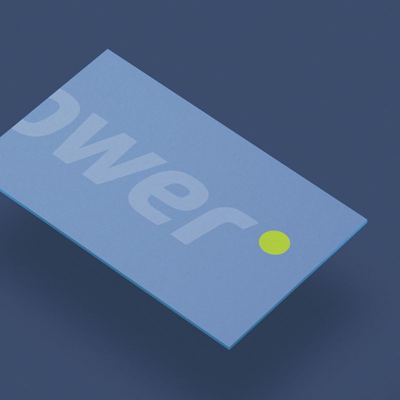
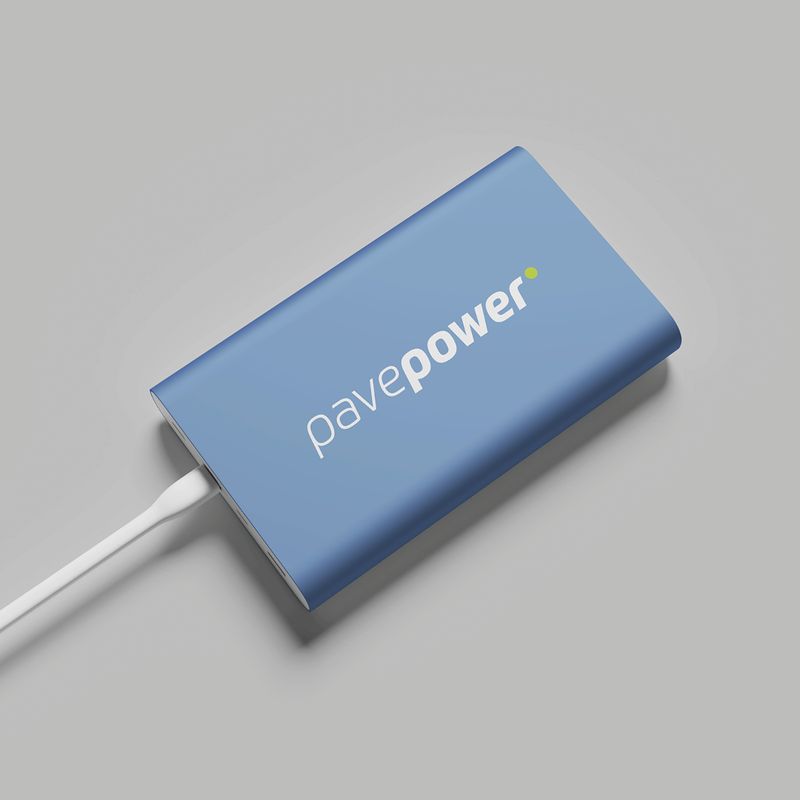
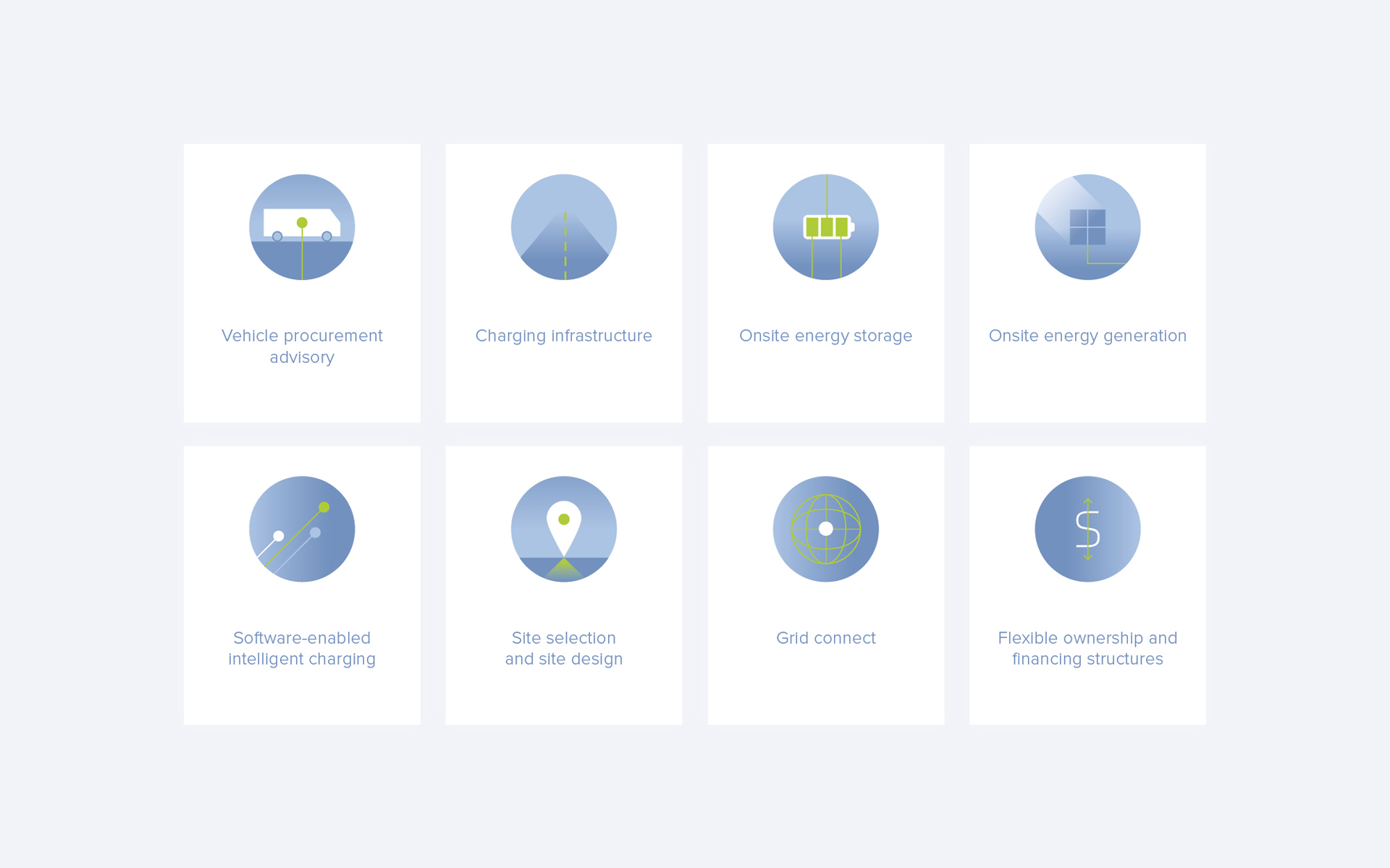
The outcome was a comprehensive set of branding assests, including a landing page, designed bespoke icons, business cards, stationery, and LinkedIn templates.

‍

Each element was meticulously aligned with Pave Power's ethos and designed to resonate with their target audience, helping them to promote their services.

left green arrow
right green arrow
3
pave-power

pave-power
Pave Power

Designed to scale.

GET IN TOUCH